The idea
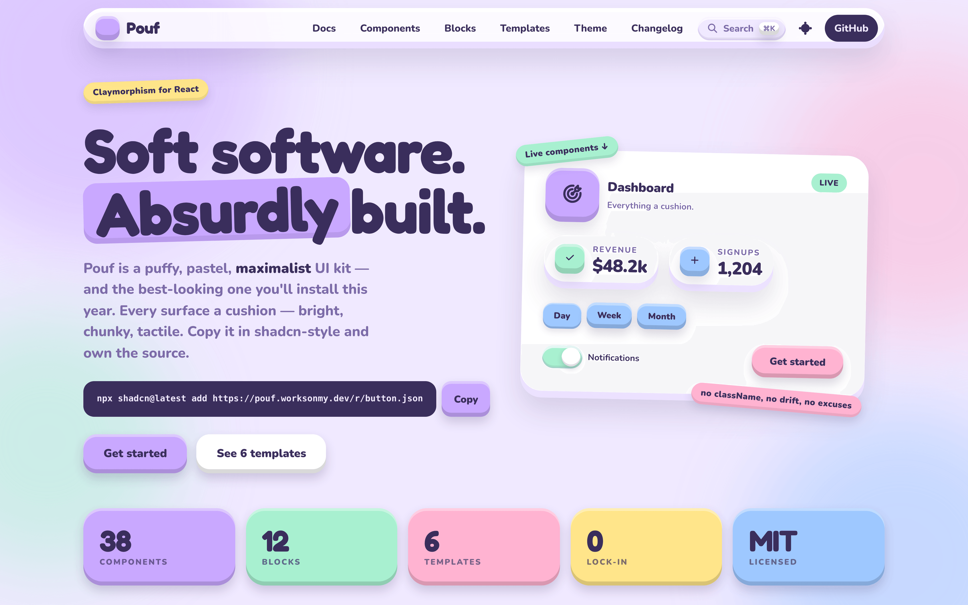
Every surface a cushion. Big radius. Inner highlight. Inner floor shadow. Outer drop. Pastel everywhere.
Pouf is claymorphism taken seriously as a component system rather than a single CSS trick — a full React UI kit where the puffiness is systematic, not applied per-component.
Principles
- Depth is the affordance. Buttons press in; badges stay flat. State you can feel, not just read.
- You own the source. Install with the shadcn CLI or copy the file. No runtime dependency to version-lock.
- Variants, not classNames. Appearance is chosen by props, so your app can't drift off-system. Need an escape hatch? You have the code.
Install
Pouf needs a React app with Tailwind CSS v4 and the shadcn CLI configured.
# the theme (tokens, cushion utilities, keyframes)
npx shadcn@latest add https://pouf.worksonmy.dev/r/base.json

# a component (pulls in its dependencies + the base)
npx shadcn@latest add https://pouf.worksonmy.dev/r/button.json
import { Button } from './components/pouf/Button'

export function Example() {
  return <Button tone="mint">Save</Button>
}
How it's built
A Bun monorepo split into three workspaces: registry (the components
themselves), gallery (a live browser plus a visual gate harness), and www
(the site at pouf.worksonmy.dev). Built on Tailwind CSS v4, Radix UI,
class-variance-authority, and Recharts.
The gallery isn't just a showcase — it carries a golden-file gate and a responsive audit, so a change that quietly breaks a component's appearance fails rather than ships.
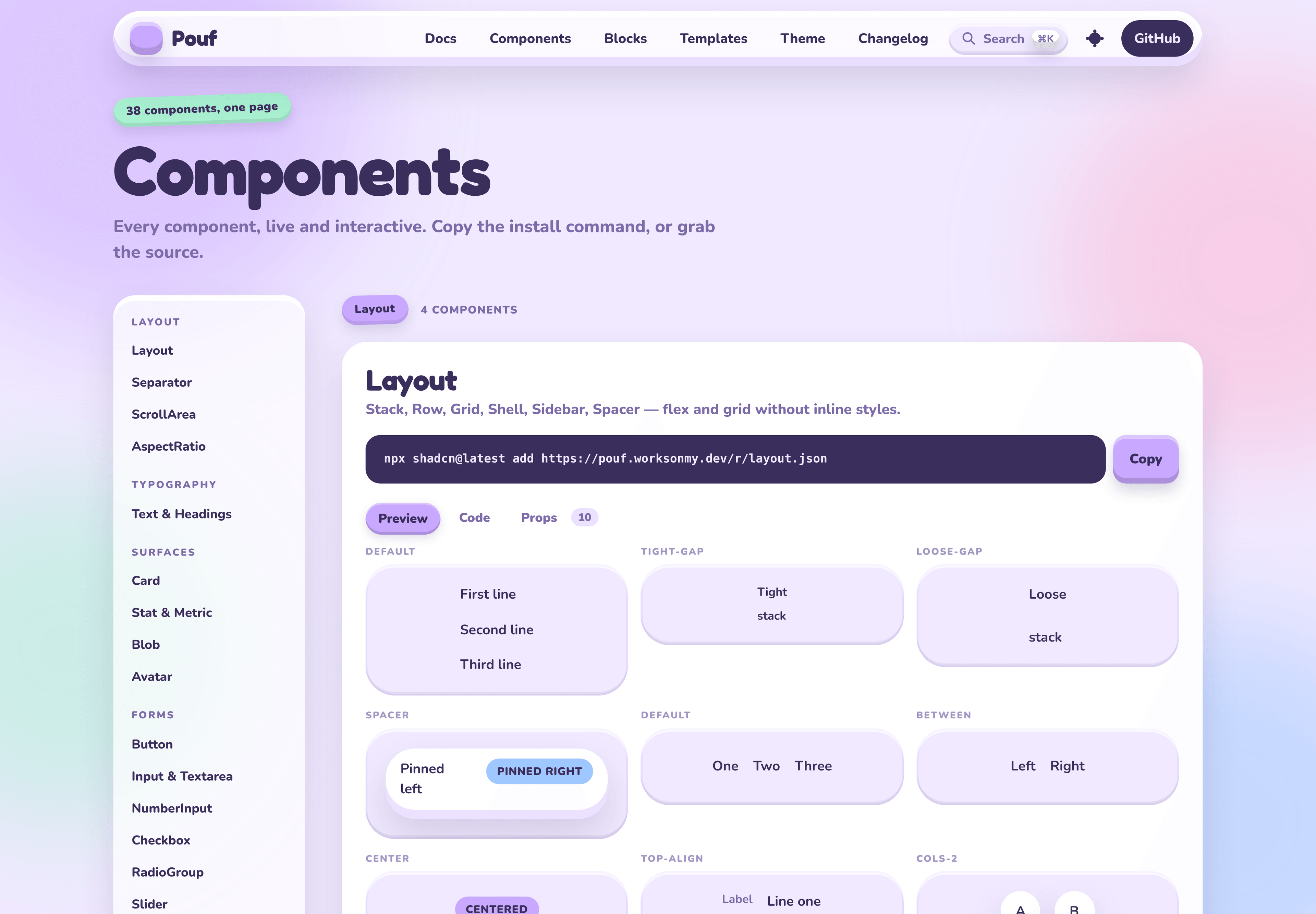
The current registry contains 38 components, 14 composed blocks, and 10 full templates. Every item is documented live with its install command and props.
Turning a look into rules
Claymorphism is easy to demonstrate on one button and difficult to sustain across a product. The system needs to explain which surfaces rise, which press inward, how nested layers separate, and how colour communicates tone without making every screen look like a toy box.
Pouf turns those decisions into shared primitives. Radius, highlights, floor shadows, outer shadows, spacing, and motion follow the same depth model across forms, navigation, data display, and feedback. Components still have distinct silhouettes, but they feel made from the same material.
The most important restraint is that depth never replaces state. A pressed button still has a clear label and focus treatment; a selected item is not identified only by shadow; destructive actions do not rely on colour alone. The visual language can be playful without making interaction ambiguous.
The registry is part of the product
Each documentation page is both a preview and an installation surface. Visitors can interact with a component, inspect its variants, copy the command, and own the generated source. Blocks and templates show how the primitives behave in real layouts rather than leaving every team to discover composition rules by trial and error.
Because the installed file belongs to the consuming app, teams can adapt a component without waiting for a package release. The trade-off is deliberate: updates are pulled consciously instead of arriving transitively.
Where Pouf works best
Pouf suits playful products, learning tools, family experiences, creative dashboards, and marketing surfaces that benefit from warmth and tactility. It is less appropriate for dense operational software where the strong material style would compete with the data. The registry makes that choice granular—a product can adopt one block or control without committing its entire interface to the theme.